Every person consumes information differently. Some people prefer text-based information, while others may prefer videos, audio, and images for context. The different ways people consume information can be a preference or related to a disability. When you communicate information in more than one way, your content is more accessible and you reach a wider audience.
Example
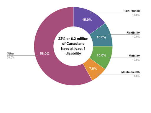
Imagine you’re trying to describe the types of disabilities that affect Canadians. You could write all the information out and present it as text, but that can quickly become confusing for someone to understand. Consider the paragraph below:
The four most common types of disabilities amongst Canadians are pain-related, flexibility, mobility, and mental health. Pain-related disabilities make up 15% of all Canadians with disabilities, making it the most common disability in Canada. Flexibility and mobility disabilities are each 10% of Canadian disabilities, and mental health-related disabilities make up 7% of disabilities. All other disabilities sum up to 58% of Canadians with disabilities. In total, about 22% of the Canadian population aged 15 and up have a disability; that’s nearly 6.2 million Canadians.
While the information is all there, the above paragraph makes it difficult to pick out the relevant statistics. Instead, it’s beneficial to supplement the text content with a visual representation of the data to increase understanding. You can do this by including a graph like the one below:
Comments
0 comments
Article is closed for comments.